Initial Font Choices
The first font we used in our OTS was the default 'Helvetica' that came with basic title transitions in Final Cut Pro. We decided this looked too basic however, as we needed something that would link to the internet world, such as coding, glitching or web text that would be more appropriate.

Final Font Choice
After testing several different fonts to see what we be appropriate for our OTS, we ended up searching the internet for a font which would ressemble something more glitchy and therefore suit our theme of the 'Dark Web' a lot more. As seen in the picture below this font appears to be corrupt as certain parts of the letters

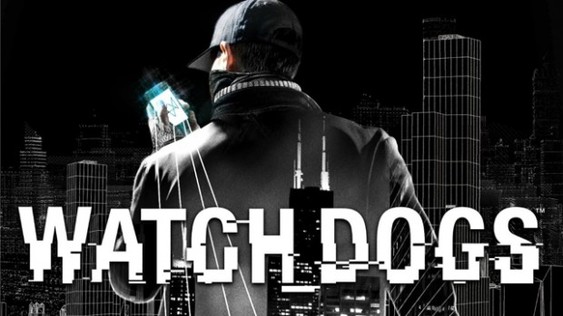
This font was inspired by the 'Watchdogs' game franchise, which also had strong connotations to hacking and the dangers of using a computer to carry out dangerous tasks.
Overall, we decided to have Minimal Titles as not to take away any focus from the footage and place all text on blank slides with a black background. We all decided to keep the text a white colour, as red would indicate more of a slasher sub-genre, where ours will be psychological. This simple colouring and font choice combined with a prism film effect helps give the impression of a corrupted series of clips that tell a semi-linear story.
